- Loading OT features…
- Loading OT features…
- Loading OT features…
- Loading OT features…
- Loading OT features…
- Loading OT features…
- Loading OT features…
- Loading OT features…
- Loading OT features…
- Loading OT features…


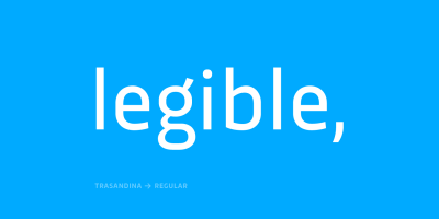





Trasandina is a very unique font-family: a modern, versatile, workhorse typeface with a special personality, given by the mix of humanist and geometric models, remaining far from both extremes.
This typeface has 9 styles plus their matching italics, it has an incredible wide range of weights, from very thin to an ultra thick stem. This was made following the Luc(as) de Groot’s Interpolation Theory. Trasandina’s versatility also resides in the +800 characters that each weight includes, having several open type features and language support for more than 200 languages. This font has been specially designed for web (using hinting instructions), making it work in small and large sizes on different types of screen resolutions.
Trasandina’s most interesting feature is its flexibility: On one hand, is easy to read thanks to its humanistic letterforms which allow this typeface to be legible in small sizes while remaining neutral (specially around its middle weights). And, at the same time, it’s perfect for logos and posters that need a lot more personality, this is mainly due to its more geometric nature in light and bold weights.
Technical details
Key OpenType features
Discretionary ligatures
Standard ligatures
Lining figures
Oldstyle figures
Proportional figures
Stylistic alternates
Small caps
Tabular figures
Available formats
.otf
.ttf
.eot
.woff
.woff2
.svg
Language support
137 languages
Glyph count
804 glyphs
Individual Styles
- Trasandina Thin
- Trasandina Thin Italic
- Trasandina Extra Light
- Trasandina Extra Light Italic
- Trasandina Light
- Trasandina Light Italic
- Trasandina Book
- Trasandina Book Italic
- Trasandina Regular
- Trasandina Regular Italic
- Trasandina Medium
- Trasandina Medium Italic
- Trasandina Bold
- Trasandina Bold Italic
- Trasandina Black
- Trasandina Black Italic
- Trasandina Ultra
- Trasandina Ultra Italic
Buy Trasandina
For other licensing options (Digital Ads, Broadcasting, Server, Digital Publications, Device, etc…) Contact Us.
Prices expressed in dollars.